There is a particular kind of bedroom that is faultless in every individual detail and curiously lifeless as a whole. The walls wear a tasteful color, the furniture is handsome enough, and still the room holds itself at a distance, more showroom than sanctuary. The usual instinct is to reach for the chequebook in pursuit of luxury: a grander bed, a sculptural light, a rug with a serious price tag. Yet the true remedy is almost always quieter, cheaper, and entirely overlooked. The room is starved of texture.
Why flat rooms feel cheap
A room pitched in a single register, all smooth surfaces or one unbroken finish, gives the eye nowhere to rest and nothing to discover. Color alone cannot rescue it, because even the most beautiful shade, laid flatly across a space, behaves like a backdrop rather than a room. What makes an interior feel warm, considered, and quietly luxurious is the conversation between surfaces: the coarse set against the polished, the matt against the sheen, the soft against the structured. Strip that away, and even the finest furnishings look oddly thin because the room offers them no depth to settle into.
Texture is what actually reads as luxury
It is worth studying what genuinely signals luxury to the eye, because it is seldom the cost of anything. A room can be furnished entirely in expensive pieces and still feel meagre, while a modest room layered with varied textures feels properly opulent. The eye reads depth and tactility as a form of richness, which is why a chunky knit thrown across a crisp cover, or a slubbed linen beside a smooth painted wall, does more for a room than any single indulgent purchase. Texture is the very quality people spend so freely chasing when they shop for luxury, when much of it can be gathered from things that cost almost nothing.
Part of the reason is that truly cheap rooms tend to be flat ones. Mass-produced interiors lean on smooth, uniform surfaces because they are cheaper to make, and so the eye has quietly learned to read flatness as economy and varied texture as care. Working with that instinct costs next to nothing. A second-hand wooden stool with its grain on show, a washed linen cushion, a basket woven from natural fiber: none of them is dear, yet each lends the tactile variety that high-end rooms are full of. The aim is not to spend like a luxury interior but to borrow the single quality that makes luxury interiors look the way they do, and more often than not, that quality is texture rather than price.
Building contrast on the bed
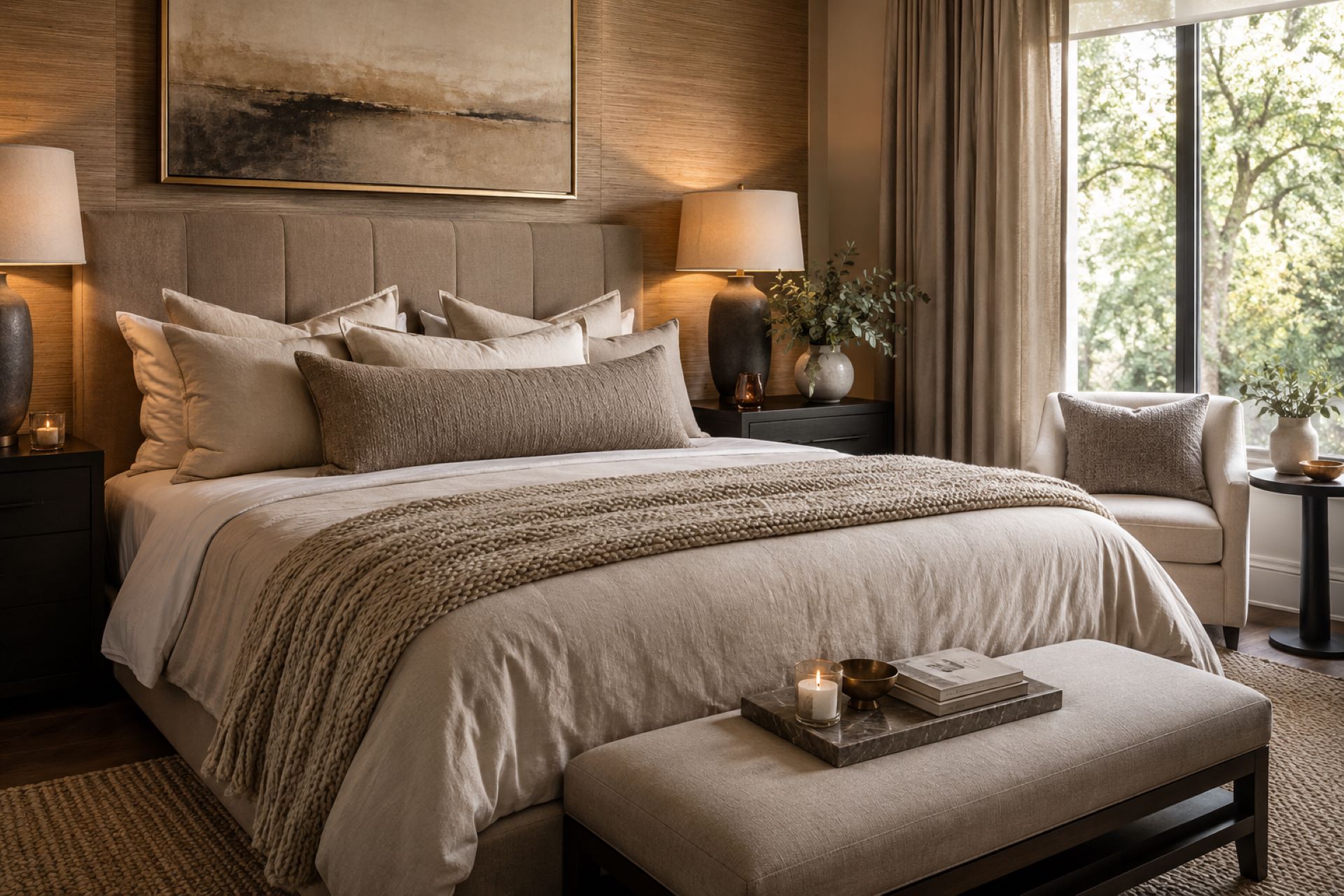
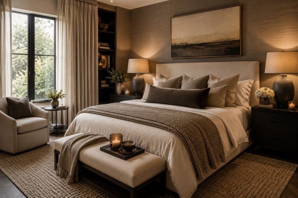
The bed is the natural place to begin, being the largest soft surface in the room and the one best able to carry contrast. This is where layering textures with quality bedding does the heavy lifting, because a bed dressed in one flat finish always looks unfinished, while a bed that gathers a few different weaves and weights looks expensive and composed. A smoother cover beneath a more textured throw, a crisp sheet under a softer duvet cover, a cushion whose surface differs from everything around it, and the bed acquires the depth that pulls the whole room together. Nothing needs to match. It needs to contrast.
Carrying the luxury beyond the bed
Once the bed is earning its keep, the same principle travels outward into the rest of the room with very little effort. A woven basket near smooth-painted walls, a rug with some pile against a hard floor, curtains with enough body to fall in proper folds rather than hanging flat: each adds to the layered, high-end effect. The point is not to crowd the room with objects but to vary the surfaces already in it, so that the eye keeps finding small contrasts as it moves. A handful of deliberate textural choices, spread through a space, achieve more than any single statement piece ever could.
Luxury without color chaos
The beauty of texture as a tool is that it adds interest without adding noise. A room can hold to a tight, restful palette, a few related neutrals, and still feel layered and luxurious, because the variety rises from the surface rather than from quarrelling colors. This is the sleight of hand that makes pared-back, expensive-looking rooms feel considered rather than sparse. They’re not leaning on bold color to hold the attention; they’re leaning on the quiet interplay of matt and sheen, coarse and smooth, soft and crisp. Restraint in color and richness in texture turn out to be natural companions, and together they read as understated luxury rather than effort.
Depth is cheaper than luxury looks
The reassuring part of all this is that texture is among the most affordable improvements there is, which is exactly why it gets passed over for larger, costlier gestures. Swapping in a few pieces with varied surfaces, dressing the bed with proper attention, and threading some contrast through the room can transform how luxurious a space feels without disturbing the structure or the budget in any real way. A flat room is rarely short of money. It is short of depth, and depth is something the eye reads, not something the wallet must provide.
That is heartening for anyone chasing a luxurious look with one eye on the cost, because it means the distance between a flat room and a rich one is closed with attention rather than expense, and attention is the one resource a careful eye always has to spend. Get the textures talking to one another and the room finally looks like the kind of place luxury is supposed to feel like, somewhere a person genuinely lives.